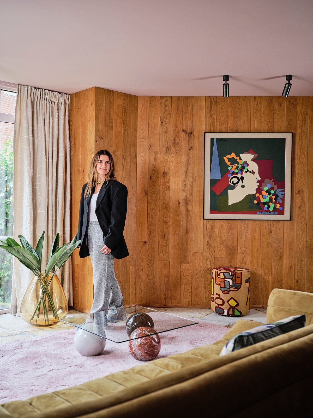
When interior designer Nicole Dohmen of Atelier ND Interior takes on a project, she doesn’t hold back.
Her work is unapologetically bold, joy-filled, and layered with personality—and this Utrecht condo in the heart of Holland is no exception. Designed for a stylish and sophisticated publisher, the home is a fearless celebration of maximalism, feminism, and self-expression. There’s no whisper of restraint here…only a crescendo of color, texture, and style.
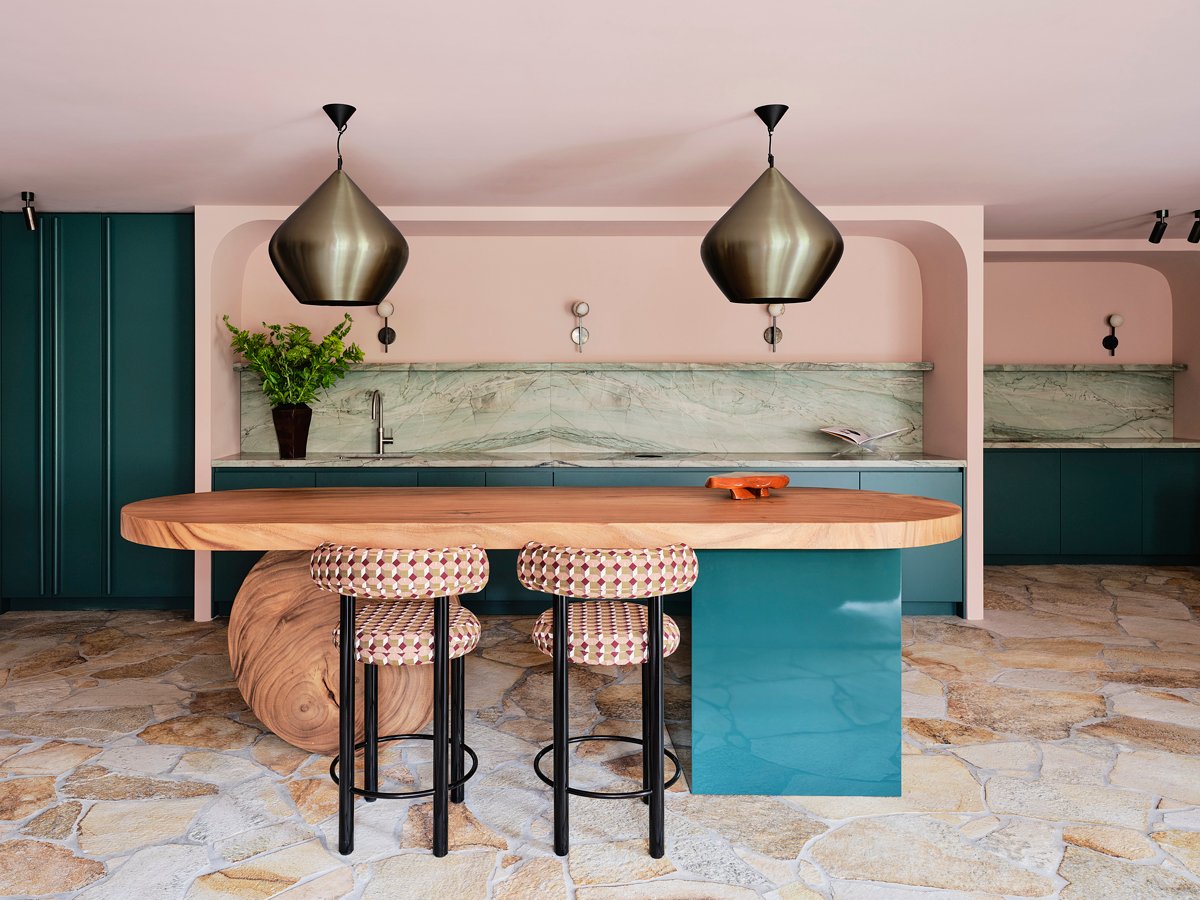
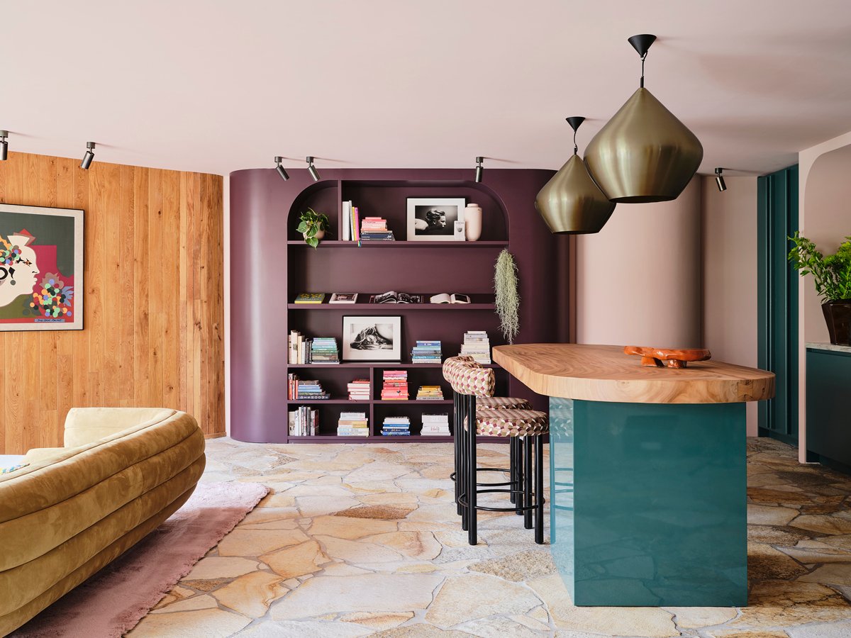
Originally built as a church, the condo retains echoes of its past: stone flooring, pillars, and lovely natural light. But it needed a fresh perspective to truly sing as a residence. The main living area, an open-concept space combining kitchen, dining, and sitting zones, offered both opportunity and challenge. Dohmen embraced the existing architectural elements and layered on her own touch: rich wood paneling that nods to mid-century style, and a materials mix that balances tension and harmony. The palette—aubergine, ochre, rose, and petrol (a deep teal)— delivers an immediate jolt. “Color is very powerful,” she says. “It’s not a trend—it’s a tool.” The result is otherworldly, evoking a space that feels unbound by time. It’s intriguing, invigorating, and unlike anywhere else.
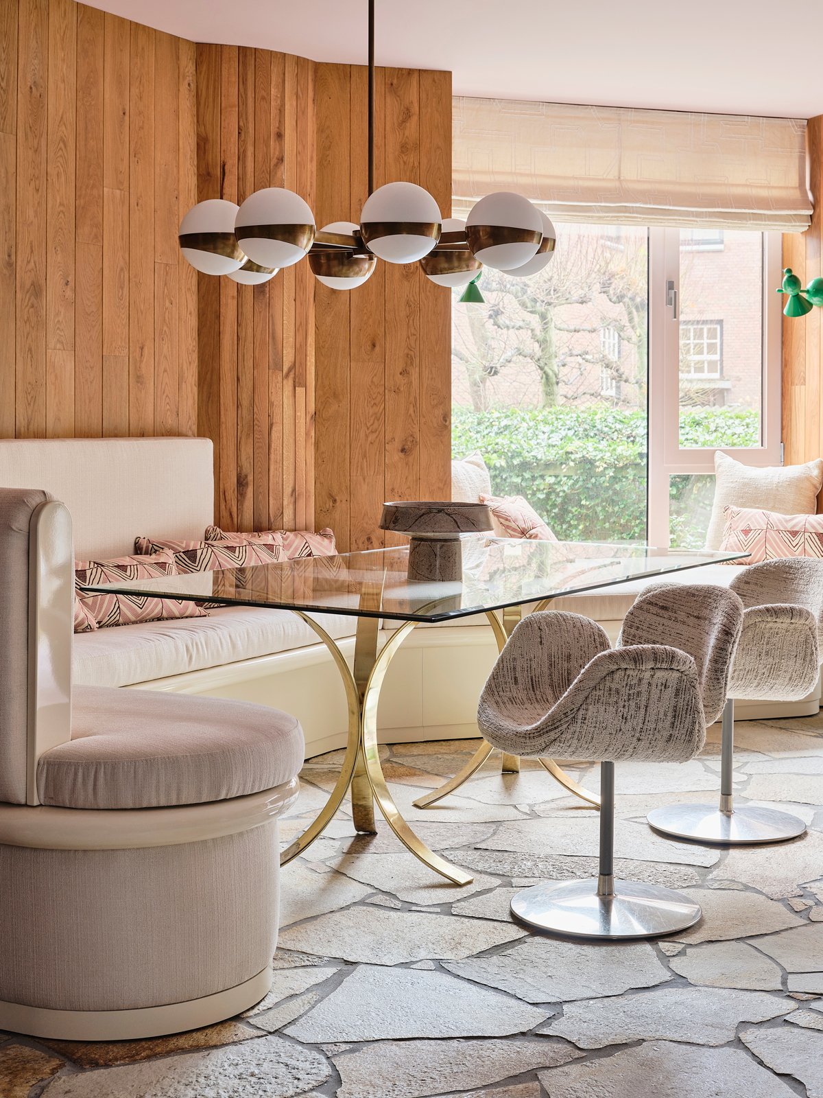
In the kitchen area, the island conjures the elegance of an atelier rather than a utilitarian prep space. “We designed this piece so that it’s more like a centerpiece, seamlessly merging the two zones,” explains Dohmen. The matte aubergine bookshelf beyond enhances the sculptural effect with it’s curved edges and angled reading shelf. On the other side of the room, a built-in banquette offers a plush, practical, and stylish dining solution. A vintage Fritz Hansen wire accent chair in a vibrant green and a Baxter Tactile sofa in a muted mossy hue rest atop a soft pink shag rug.
Color, here, isn’t an accent—it’s the foundation. It defines zones, bridges transitions, and injects surprise. In Dohmen’s hands, color becomes a design language all its own. “Color can be calming when it’s cohesive,” she notes. That philosophy extends across the apartment: tones repeat, evolve, and echo from room to room, creating flow and unity. Rather than treating each space as a standalone statement, Dohmen threads a throughline—one hue or material reappearing elsewhere, subtly connecting the dots.
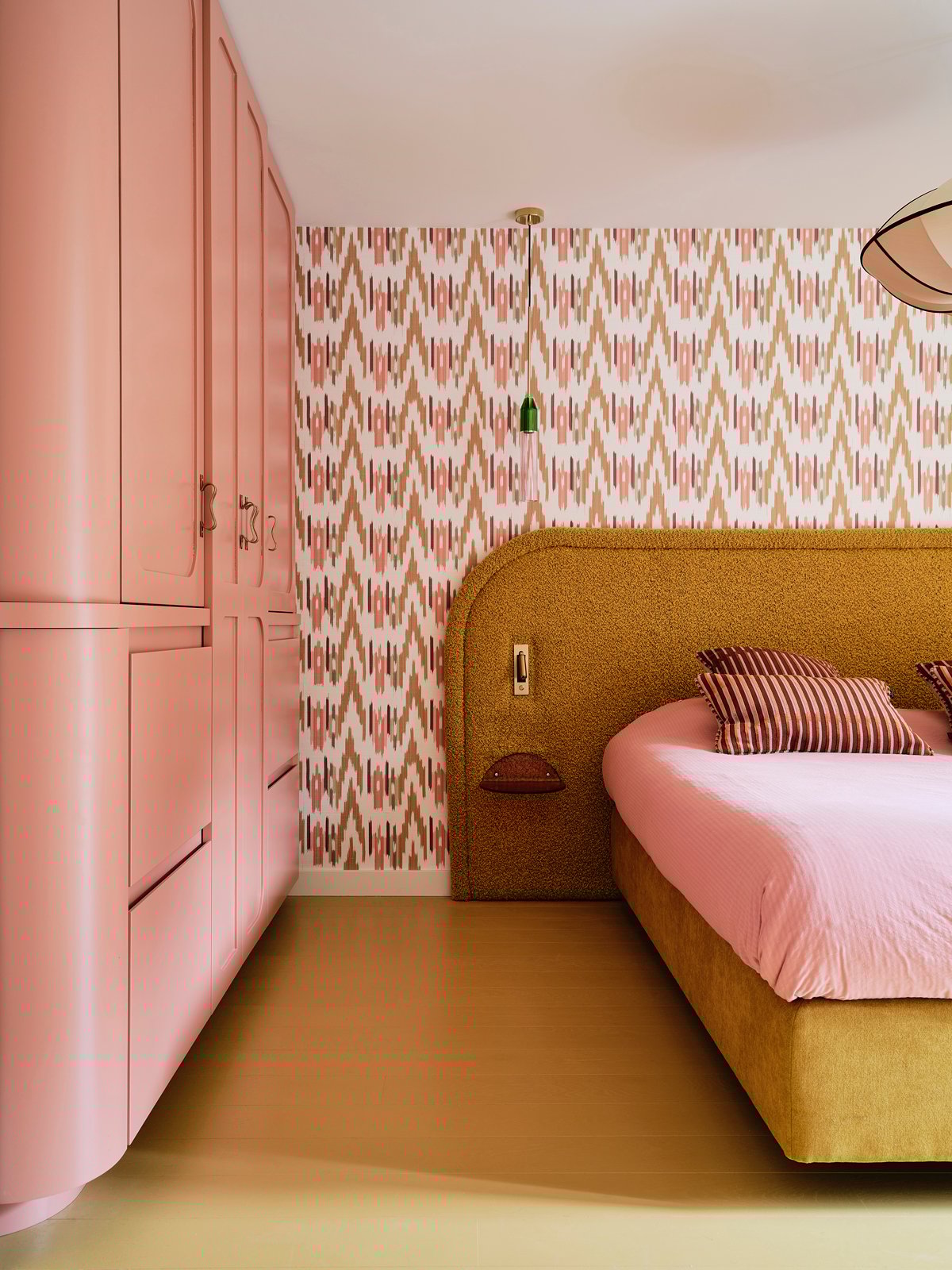
“When designing a home, the rooms need to speak with each other. If you have several bold colors in one room, take one of those colors and carry it into the next, creating a sense of overall cohesion,” explains Dohmen. The ochre from the kitchen barstools are carried into the primary bedroom, a jewel box of saturated hues and vibrant prints. Vivid wallpaper sets the stage for a custom headboard with built-in reading lights and small-scale night stands. The effect is immersive and dimensional. “You can create intrigue with different tones of the same color,” Nicole says. “You can do different shades of peach or purple, for example.” The curves of the built-in armoire further elevate the experience. This retreat is an energizing, intriguing cocoon for the senses.
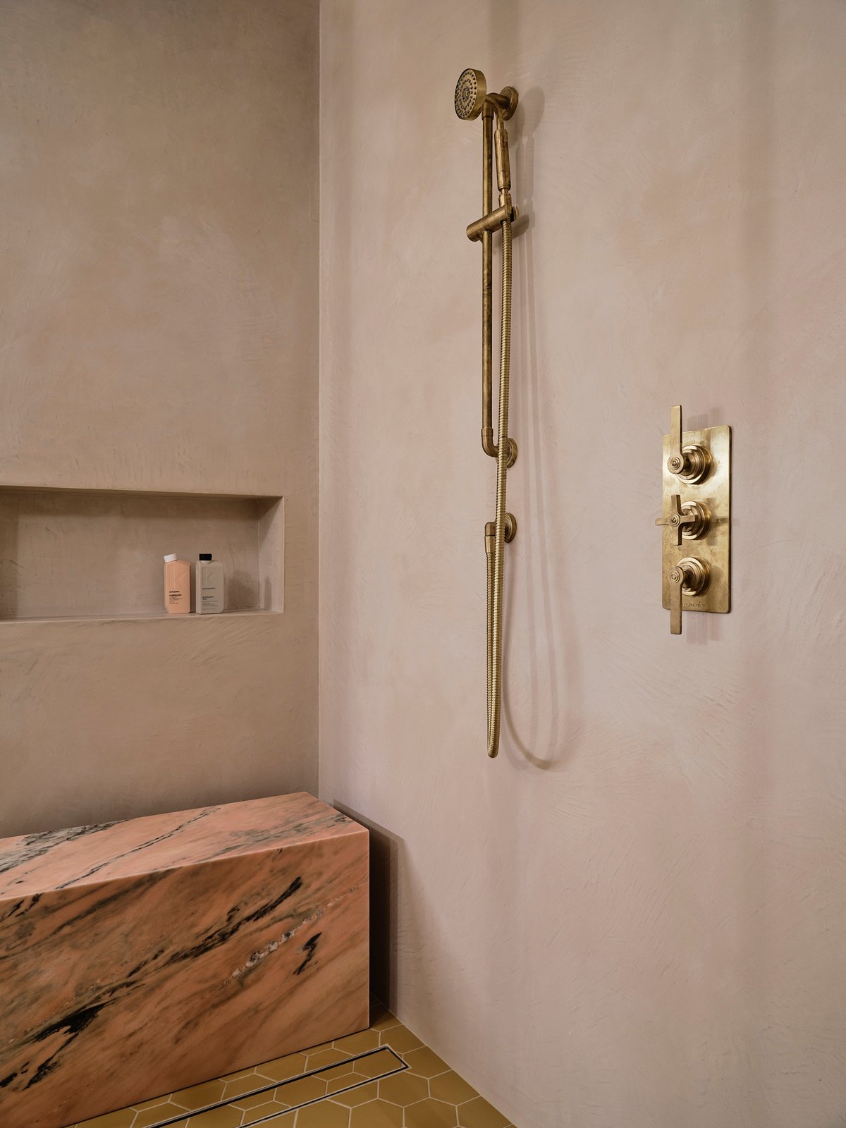
The bathroom continues the story, with a stunning bench in pink marble, neutral textured walls, and a deep oxblood color on the metalwork. The unlacquered brass of the showerhead and hardware will beautifully patina over time.
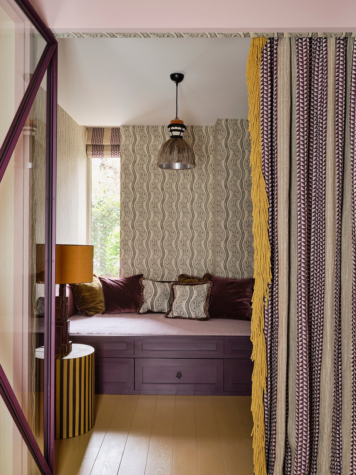
In the petite guest room, space is expertly utilized, with the custom built-in bed doubling as a sitting area when not in use. The graphic print draperies with dramatic fringe can be pulled for privacy, or left open, allowing natural light to stream through the glass doors. The pattern on the wallpaper is brought into the pillows, and the striped side table adds one more large-scale pattern.
Dohmen’s expressive approach is shaped by an unconventional path through fashion, photography, and publishing. Her interiors feel like stories—editorial, emotional, and deeply personal to each client. For those seeking more personality in their own spaces, she offers a starting point: “Start with a thing you like the most,” she says. “If it’s a printed fabric or carpet or a sofa, just start with that. Then brainstorm. Don’t try to be perfect. Don’t do 100 Pinterest pages, just do three per room. Take the vibe you really love and go for it. Embrace color. Life is too short to live in white boxes.”
This Netherlands church-turned-apartment pulses with that same vitality. It isn’t afraid to be bold, it isn’t afraid to be beautiful, and it certainly isn’t afraid of color. Is your home ready for a dose of fresh color?
TEXT BY JASMINE BIBLE + PHOTOGRAPHY BY SPACE CONTENT STUDIO
— We shared this House Tour: Playful Precision story with you in the Winter 2025 issue of NEST Magazine.